Cooling control system UX UI Design for Sky IMU clients
Sky I.M.U Offers technological solutions, maintenance and control services for a variety of fields, such as refrigeration control, traffic and transportation, security and safety, electronic communications, production systems, control systems, cash registers, information systems and more.
YEAR 2021-2022
FIELD System UX UI
ROLE Freelance, UX UI design
01
Cooling control system
SKY web software is cloud based, and allows easy and efficient remote connection to temperature control systems and a variety of cooling units, helping to monitor cooling rates in the business, filter and catalog alerts and identify small and large failures that can turn into expensive damages.
With the help of the system, it is possible to assimilate quick processes of energy efficiency and lead to significant savings in direct and indirect costs in the field of refrigeration and air conditioning.
02
The goal
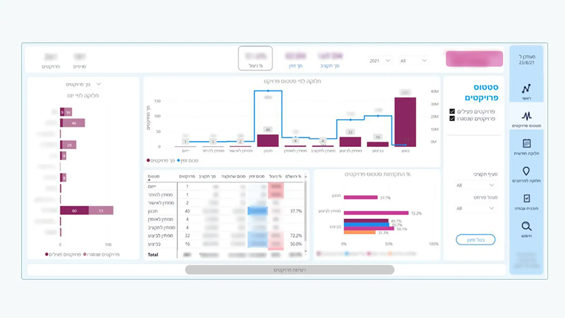
Creating a convenient user interface adapted to users with different roles with different privileges and different reference metrics. Branch managers, area managers, technicians, etc. A lot of data that should be presented in a clear and intuitive way that will help relevant professionals to solve the existing problems in the branches quickly and efficiently as possible.
04
Highlights and goals for the system UX
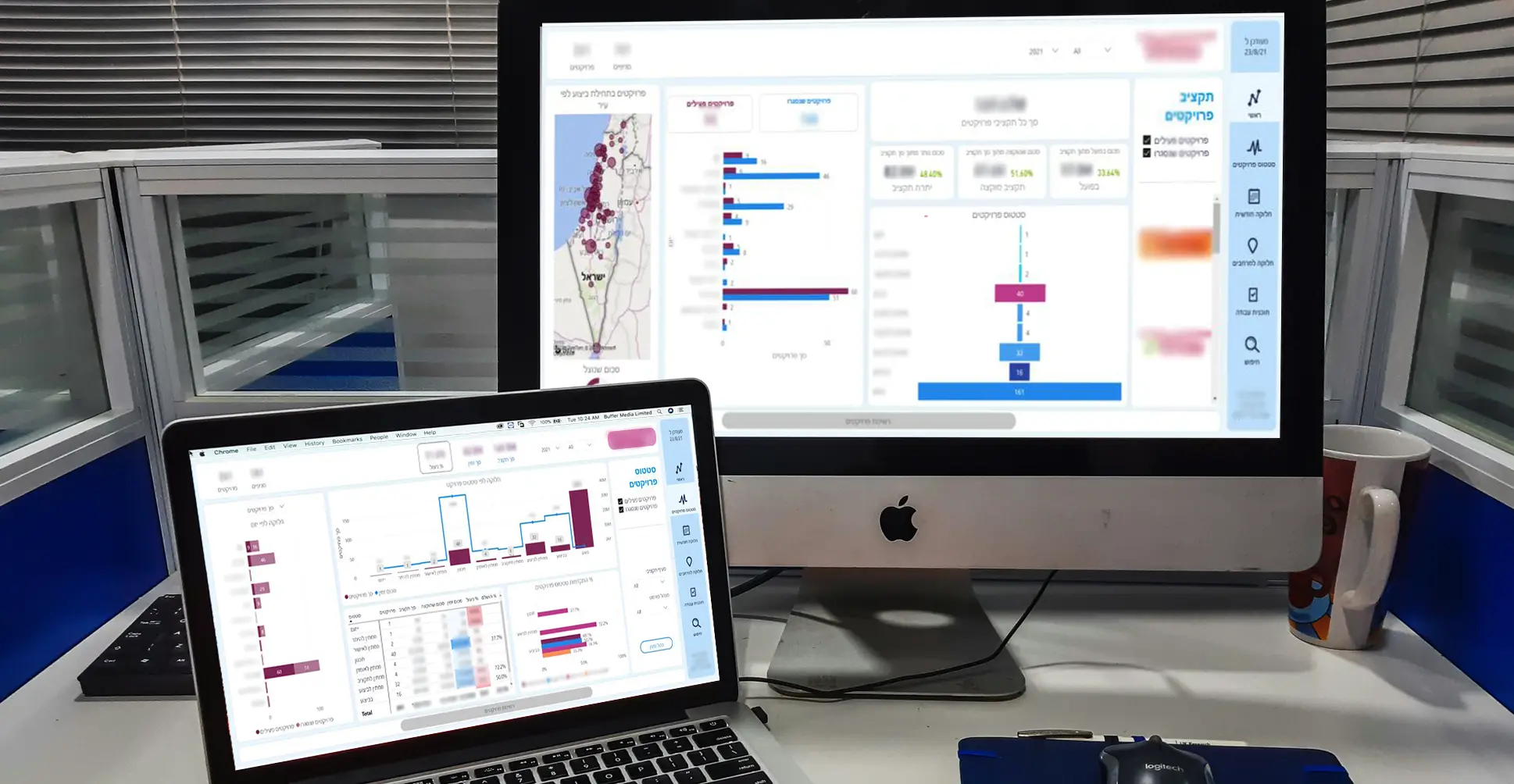
The system is being used by different stake holders that require different data and different views of the faults and the cooling indicators relevant to them. Each user is located in different enviorments. office, phone, noisy or quiet places so the relevant data to the user should be
clear and summarized in every view.
Simplification of the information. Presenting complex data-laden screens in a simple way to assist the user in making quick decisions to avoid having expensive damages.
Creating a design adapted to the client’s brand and with its help creating a clear separation between the various components, emphasizing the data, and quieting the visual load.
05
The Solution
Using the colors of the brand which accompanies the user throughout the entire system and enables a clear separation between the filters, the general data and the specific data on each screen.
with the help of a side menu and a suitable filter that accompanies the user throughout each operation and maintains the orientation, thus preventing confusion and mistakes.
for identical controls, including the use of iconization to prevent confusion and to teach users as quickly as possible the options available to them in using the system.
